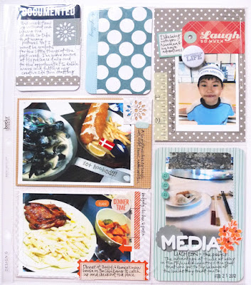
Had fewer photos this week so it seemed like a good time to play with the Design G page protectors of Project Life. I actually quite like the dynamic of having horizontal and vertical photos next to one another.
This week's spread took longer than I had imagined it would. I think I need to spread it more throughout the week instead. Due to a lack of photos, I decided to use my own printables in the spread. They can be found in my shop that you can get to from the sidebar or in my etsy shop. Used foam thickers in this week's layout and learnt that they were fragile and nearly ran into a few issues, but all's good. I also dug quite a bit into my stash to make it work!
Here's a few close ups
The right side
Liked this side a lot more for some reason (: Maybe its the food pictures and an adorable little boy (:
Lots of blues, greys and krafts. The badge "snapshots of life" can be found in my shop.
So that's it for Week 8, do leave me any questions you may have in the comments, and I'll get back to them as soon as I can.
Project Life is a line of products by Becky Higgins, and can be used for documentation of daily life or anything else you may want. I am using it to remember the year and take more photos of my everyday. For those who live in Asia, you can get your PL supplies from Scraplicious. Follow my PL journey here. You can check out more project life week pages all around the web, check out The Mom Creative.
Oh I also have a small shop update with my re-done arrow shapes


Love your spreads- it turned out so great even though you didnt have all the pictures you wanted. I really like the detailing ie the little doilie...
ReplyDeleteLove that you used some of your own stuff to-I stopped by your shop just the other day and grapped the poloraid journaling cards-cant wait to work with them...
Lovely Project Life pages!!! I love the colors!
ReplyDeleteLove your pages! The printables are great-love the colors!
ReplyDeleteReally pretty. I love all the "extras" you've added.
ReplyDeletejust beautiful!!!
ReplyDeleteLOVE you project life pages!!
ReplyDeleteLove your title card. GORGEOUS layout.
ReplyDeleteFabulous work!! :)
ReplyDeleteLove your pages. A lovely mix of photos, card and little embellishments. You make it look so effortless.
ReplyDeleteYour pages look great. Love the title card.
ReplyDeleteI love those Thickers you used for the title card. Do you know what the style is called?
ReplyDeleteHi Samantha, the thickers are lullaby, but I believe they are now out of print.
Delete